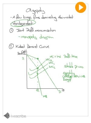
You need to be familiar with the diagrams for each type of market structure. Oligopolies occur when there are a few large firms dominating the market. An example might be supermarkets or car manufacturers where four or five large firms dominate the market.
Having a number of firms each with market power complicates the analysis as we cannot say for certain what the firm will do. Unlike perfectly competitive firms, who must simply take the market price, oligopolies are interdependent. Their decisions affect each other. They can either collude and maximise their joint profits, or compete. Either way, prices may be similar and stable so it might be hard to tell which is happening.
If firms do compete, the presence of a kinked demand curve may mean they compete on something other than price. If they were to raise prices, no other firm would follow and so they lose customers (the demand curve is price elastic) but if they lower prices, all their competitors will be forced to do so too and they gain little (the demand curve is inelastic). For this reason firms in such a situation will tend to leave price unaltered and instead compete on added extras, reward card schemes, quality of the product etc.
The tutorial below will lead you through drawing the diagram step by step. You may wish to make sure you understand the monopoly diagram first.
Unfortunately at the moment the tutorials are only available using flash so they may not work on mobile devices.
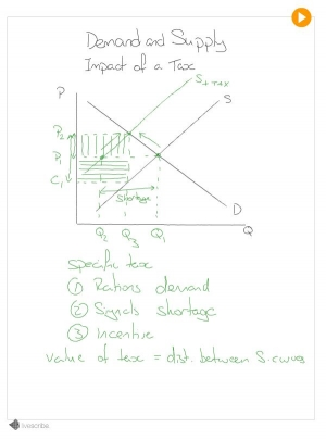
Many things can shift a demand or supply curve and students often get confused about which curve they should be shifting. There is, however an easy way to decide. Remember, the price does not change straight away, it changes because a change in demand or supply creates a shortage or surplus. The key question to ask is "If the price stayed the same, who would care?".
Take the often confused example of an indirect tax (a tax on spending). This shifts the supply curve. If the government places a tax on the sale of a good and the price stayed the same, consumers wouldn't care. They are not interested in what proportion of the price goes to the firm and what to the government, only how much they pay overall. The producer on the other hand is now keeping less of the money from each sale as some is going to the government and so they will offer less at the same price.
This video tutorial takes you through what happens after this shift in supply, how the new market price is reached and how much of the tax will be passed on to the consumer in increased prices. If you are a little unsure on how to draw a demand and supply diagram, I suggest that you have a look at the demand and supply tutorial first or you may not follow everything that is going on.
Unfortunately at the moment the tutorials are only available using flash so they may not work on mobile devices.
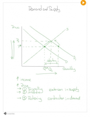
Demand and supply diagrams are the basic building blocks for Microeconomics. It is important that you are able to draw them confidently and understand how they work. Drawn with price (per unit) on the vertical axis, and quantity on the x axis, demand and supply diagrams show 2 things at once.
Where these 2 meet there will be neither a surplus or a shortage - equilibrium. The market doesn't just move to equilibrium straight away, however. The price mechanism uses the rationing, signaling and incentive functions of prices to reach equilibrium.
This tutorial will talk you though drawing the diagram.
Unfortunately at the moment the tutorials are only available using flash so they may not work on mobile devices.
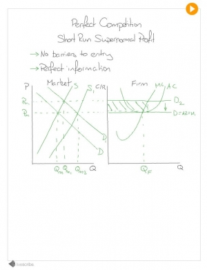
Like any firm, perfectly competitive firms aim to profit maximise. Unlike other firms, the maximum amount of supernormal profit a perfectly competitive firm can make in the long run is zero. Supernormal or abnormal profit is any profit other than the payment you need to make to the entrepreneur for his services. In the short run it is possible to generate this sort of profit but in the long run the lack of barriers to entry mean that other firms will enter the market and compete away the profit.
This tutorial will talk you though drawing the diagram. Before you look at it I suggest that you make sure you are happy with the basic perfect competition diagram.
Unfortunately at the moment the tutorials are only available using flash so they may not work on mobile devices.
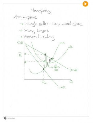
You need to be familiar with the diagrams for each type of market structure. Monopoly markets occur when one single firm dominates the market. Large firms with some competition can have a degree of monopoly power but when it comes to diagrammatic analysis we are interested in a situation where one firm has 100% market share.
Barriers to entry allow monopolies to make long run abnormal profit that is not competed away by new entrants into the market as it would have been under Perfect competition This tutorial will talk you though drawing the diagram for a monopoly. Before you look at it I suggest that you make sure you are happy with demand and supply diagrams and the profit maximising condition MR=MC. If you are not they you can search for pages about them using the button on the top right of the menu.
Unfortunately at the moment the tutorials are only available using flash so they may not work on mobile devices.
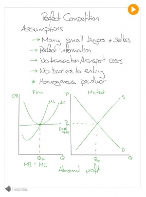
You need to be familiar with the diagrams for each type of market structure. Perfect competition is the most competitive market structure and results in a market where all firms charge the same price and make only normal profits in the long run. This tutorial will talk you though drawing the diagram for perfect competition. Before you look at it I suggest that you make sure you are happy with demand and supply diagrams and the profit maximising condition MR=MC. If you are not they you can search for pages about them using the button on the top right of the menu.
Unfortunately at the moment the tutorials are only available using flash so they may not work on mobile devices.
