
Governments can intervene in a market in many ways. They usually do so because there is some form of market failure. The free market is creating too little of a good or too much and charging the wrong price. One way that governments can attempt to fix this is to impose a maximum or a minimum price. This is done on MOTs and rents for social housing as well as being proposed as a solution to the overconsumption of alcohol.
By imposing a maximum price below the market price, firms are forced to reduce what they charge and so demand increases. Unfortunately this is not a particularly successful solution as firms will offer less for sale than before. We have managed to increase demand but supply has fallen and a shortage has been created. It does mean that access to the good or service is no longer on the basis of who has the money to pay but waiting lists or black markets are likely to result.
Similarly, a minimum price reduces the amount consumers wish to purchase but increases the amount that firms make, creating a surplus, wasting resources and risking the creation of a black market.
The tutorial below will show you how to draw the diagrams involved.
Unfortunately at the moment the tutorials are only available using flash so they may not work on mobile devices.
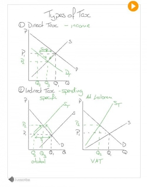
Direct taxes on income affect the demand curve as consumers have less money to spend, whereas indirect taxes on spending are charged to firms, increasing their costs and so affect the supply curve. They will, of course, pass some of this increase in costs on to consumers. It is important that you think about which tax to explain and that you explain the diagram, rather than just describing it.
This video tutorial guides you though drawing and explaining the impact of taxes on a market and considers the difference between the two types of indirect tax (specific or per unit taxes and ad valorem or percentage tax). These diagrams have not been drawn for any particular good or service but it is important that you consider the good in question as this will effect the price elasticity of demand.
The tutorial assumes that you are comfortable with drawing demand and supply diagrams. If you are not it would be best to take a look at this tutorial or this article on demand and supply diagrams before watching.
Unfortunately at the moment the tutorials are only available using flash so they may not work on mobile devices.
Many things can shift a demand or supply curve and students often get confused about which curve they should be shifting. There is, however an easy way to decide. Remember, the price does not change straight away, it changes because a change in demand or supply creates a shortage or surplus. The key question to ask is "If the price stayed the same, who would care?".
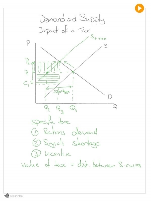
Take the often confused example of an indirect tax (a tax on spending). This shifts the supply curve. If the government places a tax on the sale of a good and the price stayed the same, consumers wouldn't care. They are not interested in what proportion of the price goes to the firm and what to the government, only how much they pay overall. The producer on the other hand is now keeping less of the money from each sale as some is going to the government and so they will offer less at the same price.
This video tutorial takes you through what happens after this shift in supply, how the new market price is reached and how much of the tax will be passed on to the consumer in increased prices. If you are a little unsure on how to draw a demand and supply diagram, I suggest that you have a look at the demand and supply tutorial first or you may not follow everything that is going on.
Unfortunately at the moment the tutorials are only available using flash so they may not work on mobile devices.
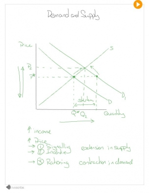
Demand and supply diagrams are the basic building blocks for Microeconomics. It is important that you are able to draw them confidently and understand how they work. Drawn with price (per unit) on the vertical axis, and quantity on the x axis, demand and supply diagrams show 2 things at once.
Where these 2 meet there will be neither a surplus or a shortage - equilibrium. The market doesn't just move to equilibrium straight away, however. The price mechanism uses the rationing, signaling and incentive functions of prices to reach equilibrium.
This tutorial will talk you though drawing the diagram.
Unfortunately at the moment the tutorials are only available using flash so they may not work on mobile devices.
