
Percentages and relative risk
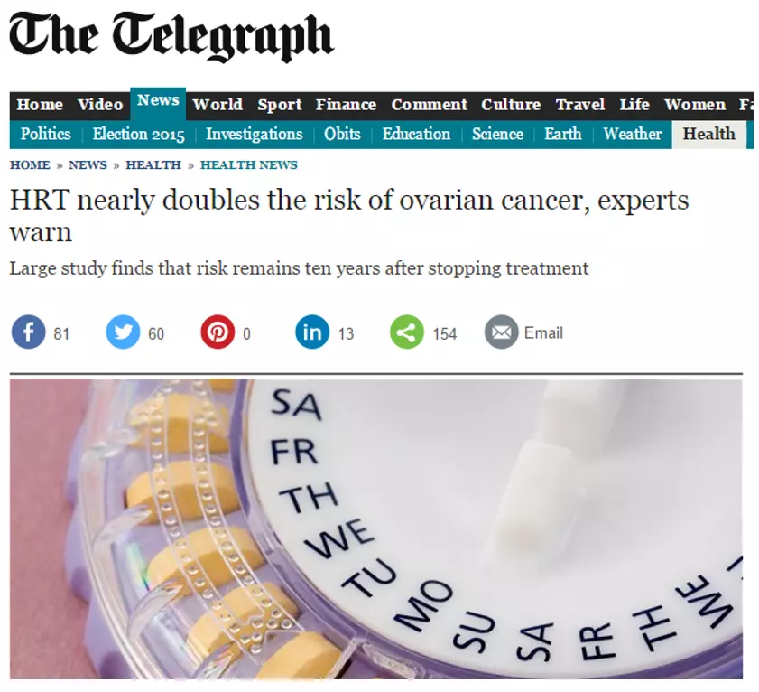
You will find this all over the place but the media loves it – they hide the true numbers with percentages to make the truth sound far more dramatic. Take this example from the Telegraph. Apparently research shows that undergoing HRT (a treatment for symptoms of the menopause) doubles your risk of ovarian cancer. First let’s be clear – the research is good: it is a controlled study with a reasonable sample size. The problem is with the way it is being presented. We are being invited to think that HRT is very dangerous. Delve into the article and you will find that for every 1000 women who take HRT for 5 years, there will be between 1 and 2 extra ovarian cancer case. But hang on a minute I hear you cry! I thought you said it doubles my chance of cancer? Allowing for some creative rounding, the claim is true, it does double the risk, but the risk of getting ovarian cancer in that 5 year time period is really very small (about 2.2 women per 1000). Doubling a very small risk may sound significant but doubling a very low number is still a very low number. Clearly we should be concerned about any additional cases of a life threatening illness but this must be weighed against the benefits of HRT. What the article invites us to do is leap to a conclusion based solely on a percentage.
Now you know what to look out for you will see this all over the place – “UK inflation halves” yes but it was only 1% in the first place, “80% fat free” – yes but that means 20% pure fat, “75% of women agree Avon makeup lasts longer” – yes but that is only 39 women (they only asked 52) and why the strange number? Who did they exclude? All of these are real examples of organisations using relative changes to hide the true impact.
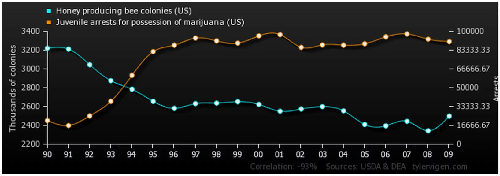
Correlation vs causation (or why bees don’t stop you getting arrested for cannabis possession).
For those of you who have read the article on logical fallacies, this will sound familiar. It is a favourite hobby horse of ours on the PPE Lessons team. We are conditioned to look for patterns. Evolutionary biologists will tell you this has something to do with recognising the rustle of leaves and associating it with the sabre toothed tiger that might be about to eat you. We don’t know about that but we do know that this sort of pattern recognition makes for lightning fast decision making, but also lots of mistakes. Jumping to conclusions helps when avoiding predators on the African plains (or just forming snap judgments about the creepy person who is chatting you up in the bar) but doing the same thing when considering the claims of, say, climate change scientists often leads to us blindly accepting what is in front of us.
Your ecowarrior friend informs you that atmospheric CO2 levels are higher than they have been at any point in the last 800,000 years (they are right) and that global temperatures are rising (they are mostly right). The obvious conclusion, they say, is that CO2 is causing global warming. For what it’s worth they are probably right about that too but they haven’t proved anything. They assume a link but who’s to say that the temperature increase isn’t causing the CO2 to be released or perhaps that something else entirely is causing both the temperature and the CO2 to rise. Worse still it could just be coincidence.
Want convincing about third causes and coincidences? Have a look at http://www.tylervigen.com/ to find your own chance relationships like this one or go back to our article on logical fallacies.
Selective data
Selective use of data is often harder to spot because there are so many ways to do it but let’s have a look at an example. Labour claim that the Conservatives aim to reduce public spending to “1930s levels”, a time before the NHS and much of the welfare state. They are absolutely right … technically at least, but the claim is designed to mislead.
Spending as a proportion of GDP would be lower than 1939. There are 2 things to note here. This is spending as a proportion of the total value of UK output. That output has gone up quite a lot since the 1930s but here comes the big dodge. Spending would not be lower than all of the 1930s, just 1939. I’m no historian but I do remember something happening in Europe that might have made government spending unusually high that year.
This selective use of data is a common ploy especially carefully selecting the start of data. For example Conservatives might talk about the increase in economic growth since 2009 (the depths of the recession) whereas Labour would prefer to talk about growth since 2007 (the peak before the recession). Both are true but give a very different impression of the record of the Coalition Government.
What next?
There are many more ways to get ‘proof’ from dubious statistics. If you are interested in the sorts of things you have been reading about, the BBC have an excellent programme on radio 4 called More or Less which interrogates statistics from the week’s news. You can listen to the back catalogue here. You could also take a look at Ben Goldacre's blog, Bad Science, or one of his TED talks.

